Swiper Slider
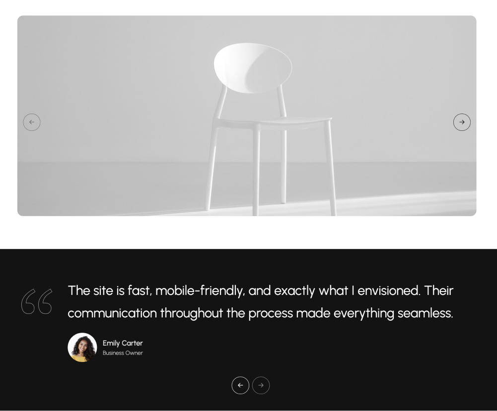
The Swiper Slider block is a customizable slider powered by Swiper.js, allowing you to create smooth, responsive sliders. You can add any type of content block to each slider item, giving you full flexibility to showcase images, text, or multimedia elements in an interactive, swipeable format. This block is perfect for creating slideshows, testimonials, product showcases, and more.
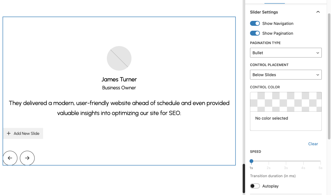
Settings
- Control Options:
- Show Navigation: Enable/disable navigation arrows.
- Show Pagination: Enable/disable pagination indicators.
- Pagination Types: Choose between "Bullet" or "Fraction."
- Control Placement: Configure control position: "Below Slides" or "On Top the Slides."
- Control Color: Customize the color of controls using a color picker.
- Autoplay Settings:
- Toggle autoplay functionality.
- Configure delay between transitions (3000ms to 8000ms).
- Responsive Settings:
- Configure slides per view and spacing for desktop, tablet, and mobile devices.
- Custom Inserter:
- Add new slides dynamically using a custom "Add New Slide" button.
Inner Blocks
- Slide Item
How to Create New Slider
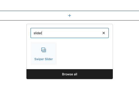
- Open the block inserter by clicking the + icon, search for Swiper Slider in the search bar, and select the Swiper Slider block.
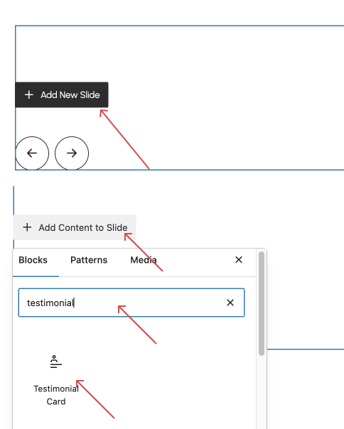
- Click Add New Slide to create a slide item, then click Add Content to Slide to add content. You can insert any block within each slide, such as paragraphs, headings, images, or other blocks. For this tutorial, let’s add a testimonial card
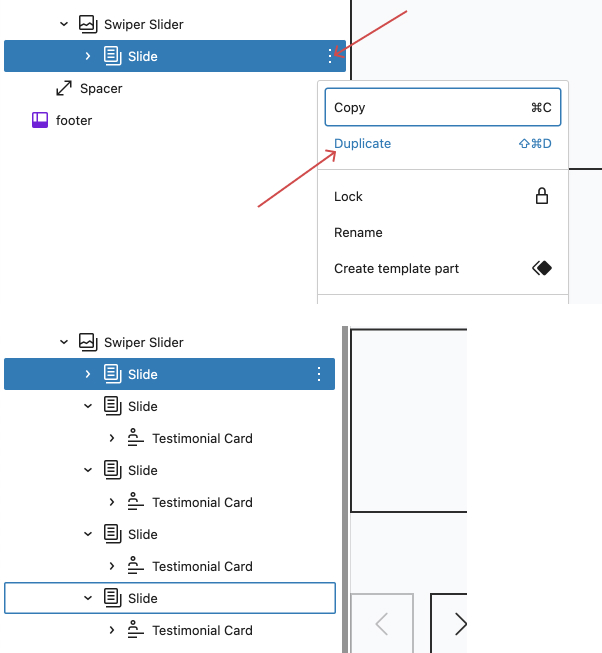
- To add more slides quickly, duplicate the first slide as many times as needed, then adjust the content of each slide. Be sure to disable autoplay temporarily to make editing easier.
- Finally, adjust the slider settings in the right sidebar to match your preferences.