Editor
Mora is fully compatible with the WordPress block editor, offering support for wide alignment, custom color palettes, font sizes, and more. With the block editor, you can build visually captivating and high-performing websites featuring creative layouts—without the need for a page builder plugin. Explore our theme demo site for inspiration and ideas on how to make the most of these powerful design options.
Block
In WordPress, a block is a modular content element that allows you to create and arrange content on your website with ease and flexibility. Each block represents a distinct type of content and style, such as paragraphs, images, headings, galleries, videos, and more.
If you need more information about how to using blocks in Wordpress, you can check out these resources below.
- Video on the Block Editor: Learn how to use the WordPress block editor through this helpful video tutorial.
- List of Available Blocks: Explore the wide variety of blocks that Wordpress offers that you can add to your posts and pages.
- Guide to the WordPress Block Editor: Get more overview of Wordpress block editor, including features and tips to help you editing your site.
This theme also includes custom blocks designed to display content in more creative way. You can use these blocks alongside the default Wordpress blocks.
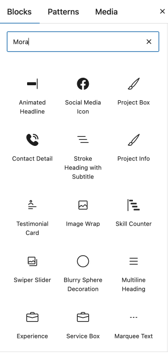
For more details about each custom block, visit the custom blocks page
Block Variations
Block variations are versions of standard Wordpress blocks with different attributes or inner blocks. Each variation gives different look or functionality for specific uses, but they're all based on familiar Wordpress blocks like headings or buttons.
For example, this theme has two heading variations
- Heading Stroke
- Heading Section Title
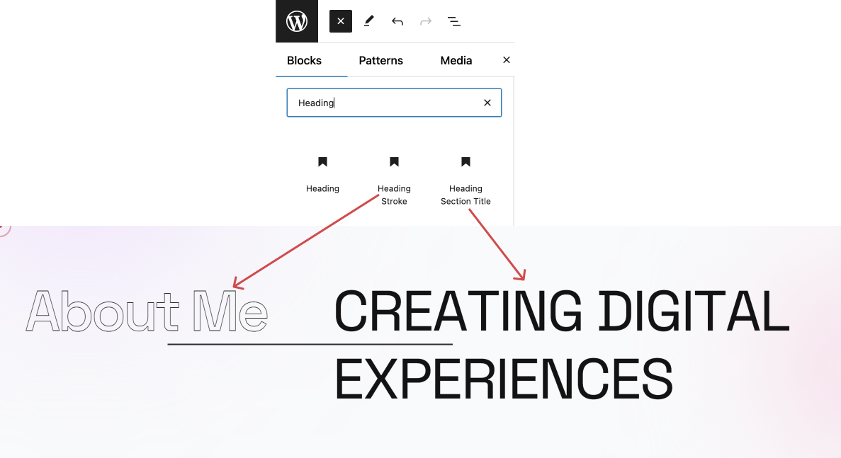
These two heading block variations have different font sizes than default wordpress heading block
Pattern
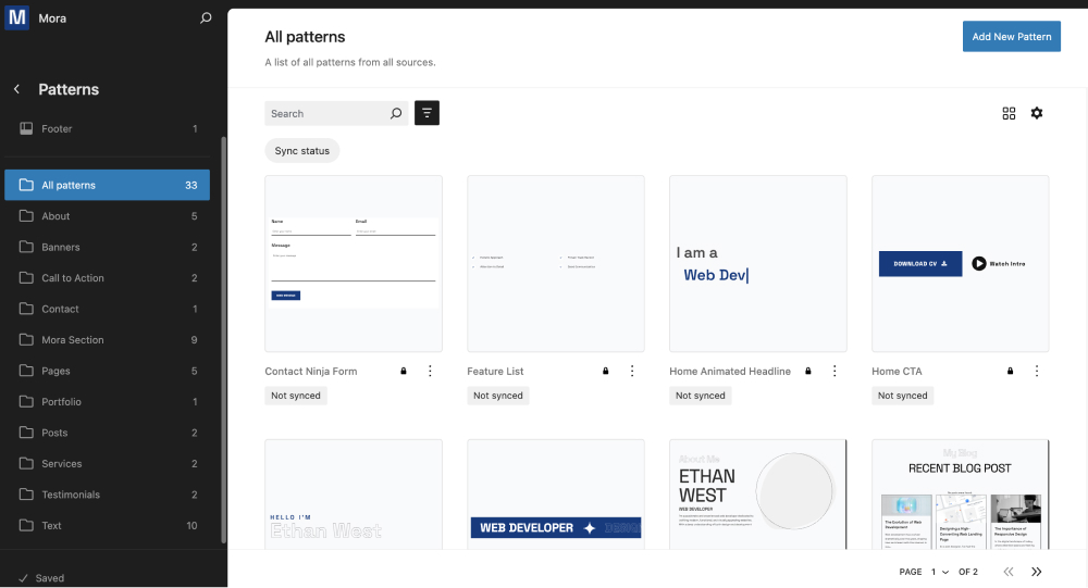
Block Patterns are pre-designed groups of blocks that you can easily add to your posts and pages, then personalize with your own content. They simplify a combination of many blocks, allowing you to quickly build sections of your site without starting from scratch.
This theme includes predesigned block patterns that contain layouts for common website sections, such as testimonials, portfolio, and call-to-action areas. Instead of manually creating each part of a section—like adding and formatting text, images, and buttons separately—you can insert a ready-made pattern and focus on adjusting only the content and minor design elements.
You can find additional design patterns in the WordPress Pattern Directory, where a variety of pre-designed layouts are available to customize your site’s look.
To learn how to add these patterns to your site, watch this step-by-step video tutorial on using the WordPress Pattern Directory.
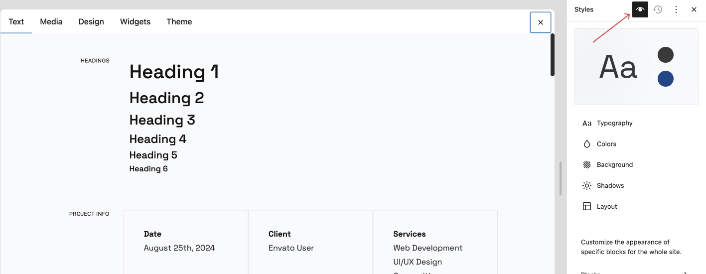
Global Styles
In WordPress, global styles are theme-wide design settings that control the appearance of your entire website, including colors, fonts, spacing, and other style elements. With global styles, a wordpress theme creates a unified look, applying consistent design choices across all blocks and elements without requiring custom CSS adjustments.
By adjusting those settings, you can easily update the overall appearance of your site, while still having the flexibility to make specific customizations where needed.
Theme Styles
Colors
Theme applies a palette of colors throughout the site elements. You can modify each individual color in palette, modify WordPress default color palette, and add your own custom colors.
Use solid colors As the theme automatically calculates additional colors from its palette, it is recommended to use solid colors, not a semi-transparent ones.
These are available colors
Here’s a selection of available color palettes designed to enhance your visual experience. Each palette serves a unique role, from foundational tones to vibrant accents, allowing you to create a balanced and engaging design.
Here's the available color palletes of this theme. Each pallete serves a unique role, from foundational tones to contrast primary color.
-
Base Colors (Base 1, Base 2, Base 3)
These colors form the foundational tones for the design. They are often neutral or subtle, providing a balanced background against which other colors (like tints, primary, or contrasts) can stand out. Example Usage: Backgrounds, large content areas, or places where color should not be too visually prominent. -
Tint Colors (Tint 1, Tint 2, Tint 3)
Tint colors are lighter versions of the base or primary colors. They are often used to highlight, add depth, or create a soft, less intense look while staying within the same color family. Example Usage: Background or borders in sections that need a softer appearance, or for text elements with lower emphasis. -
Contrast Colors (Contrast 1, Contrast 2, Contrast 3)
These colors provide the highest contrast to the base and tint colors. They help create focal points and are ideal for drawing attention to important elements. Example Usage: Heading, Title, icons, or other elements where a strong contrast helps visibility and draws attention. -
Primary Color
This is the main color associated with the design’s identity and is often used consistently across key areas to establish branding. The primary color is typically bold or distinct, providing a recognizable anchor for the overall color scheme. Example Usage: Brand elements, primary buttons, key UI components, or other visually central elements in the design.
Editing Theme Style
This theme includes two style options: Default (light) and Dark. To switch between them, navigate to Appearance → Editor → Styles.
You can also add some changes to those styles.
- In your WordPress dashboard, go to Appearance → Editor.
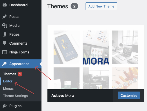
- Within the Editor, click Styles
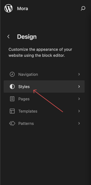
- For a clearer view of your style changes, open the Style Book for a detailed preview.